What Is Pantone Color? Why Brands Rely on It (2026 Guide)

By the Dimpal Sharma· Published 26 October 2026 · Updated 29 October 2026 · 8 min read

What is Pantone color?

Pantone color is a standardized colour reference system from Pantone LLC. Every colour gets a number, like Pantone 485 C, so a designer in one country and a printer in another can point at the same shade. Many Pantone colours are printed as pre-mixed spot inks made to a set formula.

That's the whole idea. A number instead of an argument.

If you've ever tried to describe "a warm red, but not that warm" over email, you already know why it matters.

Why does Pantone exist?

Because words are terrible at describing colour.

Take purple. There are red-based purples and blue-based ones, light ones and heavy ones, and the name alone tells a printer almost nothing. Reprints happened. Money got burned.

The fix came from a chemist named Lawrence Herbert, who joined a small New Jersey printing company in 1956, bought it in 1962, and launched the Pantone Matching System in 1963. It was a fan-style booklet of printed swatches, each with a number and an ink formula. The sources I read disagree on a few details, such as how many colours that first guide held, so I'll leave that number out.

One business write-up says Herbert also got most of the small ink makers of the day to adopt his numbering. That detail matters more than it sounds. A numbering system only works if the people mixing ink agree on it.

How is Pantone different from CMYK?

This is where most people get tangled, so here's the plainest version I can manage.

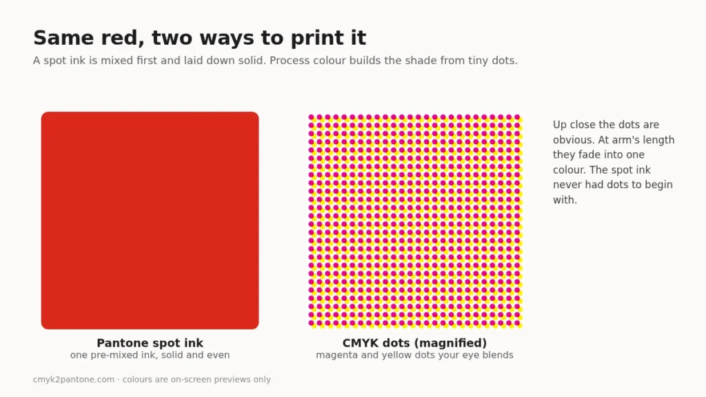
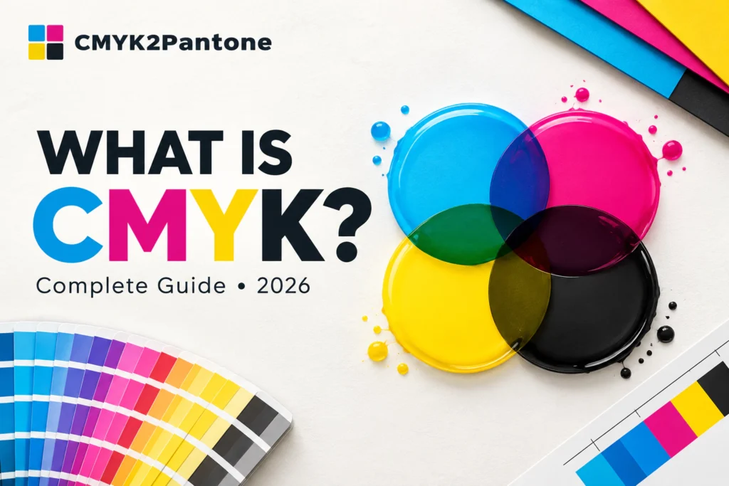
CMYK fakes a colour. It layers cyan, magenta, yellow and black in tiny dots and lets your eye do the blending. Pantone, for most of its colours, skips the trick. The ink is mixed to a formula first, then laid down as one solid colour.

Side by side comparison of a solid red Pantone spot ink and the same red built from magnified magenta and yellow CMYK dots
A spot ink is one solid colour. CMYK builds the same shade from dots.

Neither one is better. They solve different problems. If you want the longer version, we wrote a full piece on CMYK vs Pantone, and a plain explainer on what CMYK is.

FeatureCMYKPantone
How the colour is madeFour process inks in dotsA numbered reference, often a pre-mixed ink
Where it shinesPhotos, brochures, magazinesLogos, brand colours, packaging
ConsistencyShifts between presses and paperBuilt to match a reference
Typical costLower for full-colour workOften higher, because of the extra ink

What do the letters after the number mean?
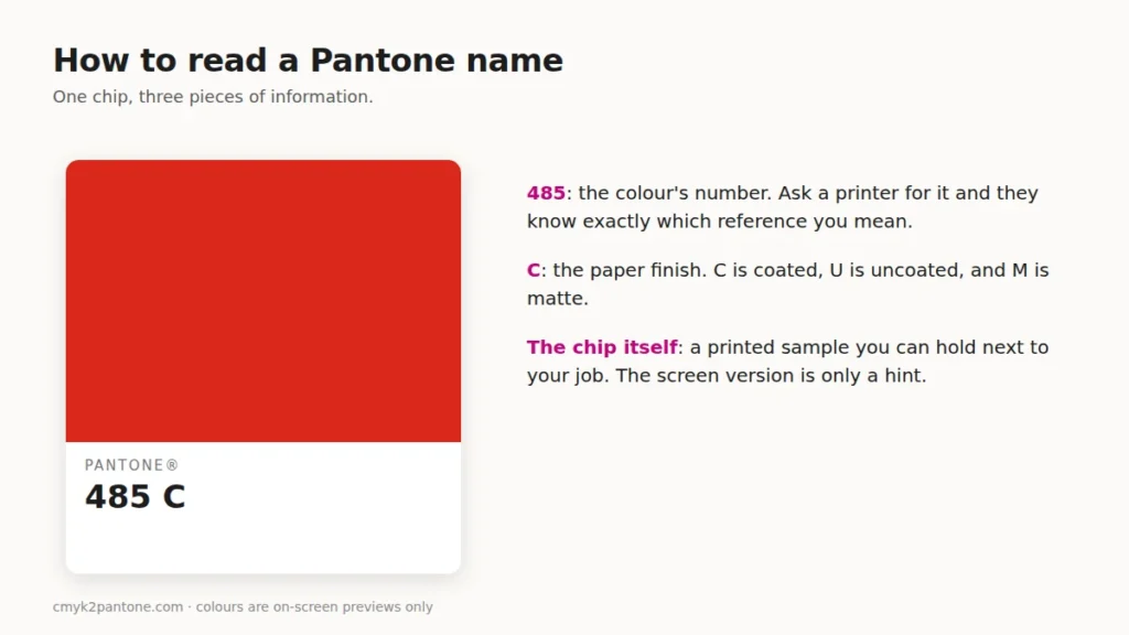
You'll see 485 C, 300 U, maybe 2995 M. The letter is the paper.

C means coated, U means uncoated and M means matte. Same number, different surface.

Pantone 485 C colour chip with labels explaining the colour number and the C suffix for coated paper
The number picks the colour. The letter picks the paper.

This trips people up more than almost anything else. Ink sits on top of coated paper, so it looks bright and deep. It sinks into uncoated paper, so it looks softer. If your brand guide says 300 C and you print on a recycled uncoated stock, you'll get something different, and it won't be the printer's fault.
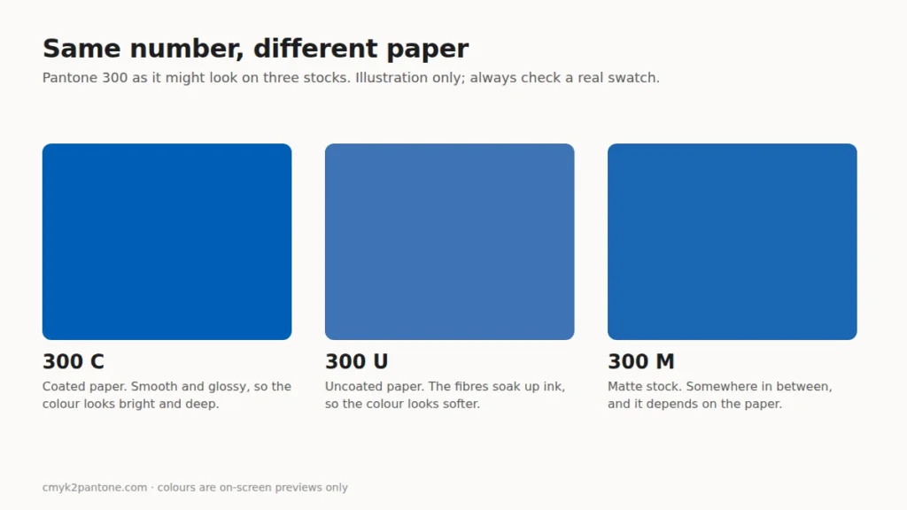
Illustration of one blue Pantone shade looking brighter on coated paper, softer on uncoated paper and in between on matte paper
An on-screen illustration. Only a physical swatch shows the real difference.

My advice: pick the letter on purpose. Don't let it be an accident.

Why do brands rely on Pantone?

Consistency. That's most of it.

A brand colour shows up on a box in one factory, a sign in another city and a business card somewhere else. If each printer guesses from a CMYK recipe, the colour drifts. Give them a Pantone number and they've all got the same target.

One business article points to Kodak as an example, saying the company locked its famous yellow to a specific reference, Pantone 1235 C. I can't vouch for the whole story, but it's a neat illustration of the point. A colour that people recognise from across a shop floor is worth protecting.

Here's my honest take, though. Most small brands don't need to spend on Pantone for everything. If your logo is one or two flat colours and it appears on packaging, then yes, define it. If you mostly print photos and flyers, the extra ink won't earn its keep.

And write the equivalents down. A good brand guide keeps the Pantone number next to its CMYK, RGB and HEX values. Our Pantone to CMYK, Pantone to HEX and Pantone to RGB pages give you quick starting values for each.

How many Pantone colors are there?

More than 2,000 spot colours. A retailer's listing for the latest Formula Guide counts 2,390, after 224 new colours were added.

That number moves whenever Pantone updates its guides, so check Pantone's own site for the current figure. To browse what's out there, try our Pantone colour chart, the Pantone colour codes page, or the Pantone colour finder.

Can you convert Pantone to CMYK?

Sort of.

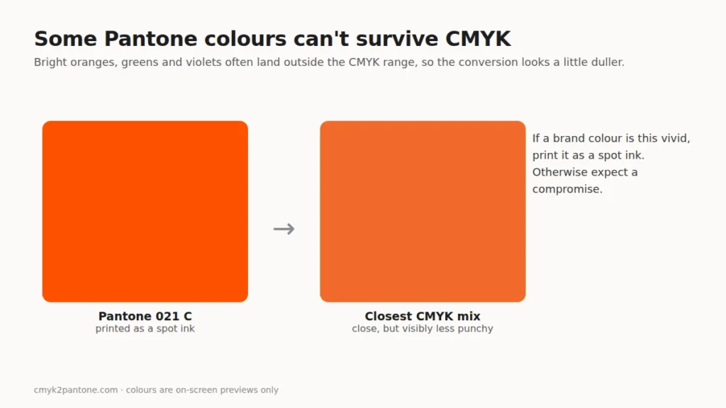
No exact formula connects the two systems, so any conversion is a nearest match. And some Pantone colours, mostly the very bright ones, sit outside what CMYK inks can reach. The CMYK version comes out duller.

Illustrative previews. A vivid spot colour often loses some punch in CMYK.

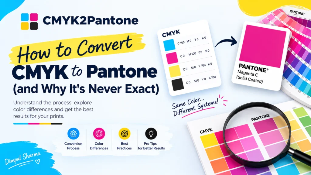
If you're going the other direction, from a CMYK mix to a Pantone reference, our free CMYK to Pantone converter does that in your browser. No sign-up. You enter your four percentages and it shows the closest match, plus two more nearby, with RGB and HEX values you can copy.

One caveat, and I'd rather say it than hide it. The converter compares your colour with a limited, growing set of Pantone Coated references, so a closer match may exist that isn't in the list yet. Treat the answer as a good first guess. Then check a physical swatch book.

Try the CMYK to Pantone converter → · Prefer a walkthrough? Read how to convert CMYK to Pantone.

Mistakes worth avoiding

Trusting your screen is the big one. Monitors emit light and every one is set up a little differently, so a Pantone swatch on a phone is a hint, not a verdict.

Old swatch books are another. Printed guides fade. If yours has lived on a sunny shelf since 2015, retire it.

Last one: skipping the printer chat. Five minutes with the people running the press tells you more than an hour of guessing. For help picking colours that behave on paper in the first place, see how to choose colours for print design.

Frequently asked questions

What is Pantone color?

A standardized colour reference system from Pantone LLC. Each colour has a number, and many are printed as pre-mixed spot inks.

What does the C, U or M after a Pantone number mean?

The paper finish. C is coated, U is uncoated and M is matte. The same number looks different on each.

Is Pantone the same as CMYK?

No. CMYK builds colour from four process inks in dots. Pantone is a reference library, and many of its colours print as single pre-mixed inks.

Why do brands use Pantone colors?

A Pantone number gives every printer the same target, which keeps a brand colour steady across materials.

Can every Pantone color be converted to CMYK?

Only approximately. Very bright shades can fall outside the CMYK range and look duller once converted.

Is Pantone more expensive than CMYK?

Usually. A spot colour typically needs an extra ink or plate, which adds cost to a standard four-colour run.
Sources and further reading

  • 4OVER4, "The History Behind Pantone Colors" (company history and Formula Guide size).
  • Finshots, "The economics of Pantone" (business history and the Kodak example).
  • Fast Company's design coverage of Pantone's origins, as quoted in secondary write-ups.
  • Pantone's own site for the current list of colours and guides.
Scroll to Top